Showing posts with label design. Show all posts

Wednesday, December 9, 2009

i'm a hipster. pardon me while i cope.


yah. i'm still coming to terms with my hipster-dom. trying to understand it all O_O
hahahah.

anywho, a good friend of mine shared this with me (he is a hipster, too *pound*). it's of another hipster (graphic designer/illustrator) talking about what he does, why he does it, and some other insights. there are a bunch of other speakers on the website as well that are informative. take a peek.

Geoff McFetridge lecture:
http://www.dolectures.com/speakers/speakers-2009/geoff-mcfetridge

website:
http://www.dolectures.com/speakers/

Friday, September 25, 2009

Logos and designs in different languages

Something you don't see everyday (at least in this country!). We're constantly surrounded by examples of typography designed using the Latin alphabet, so it's interesting to see typography from a non-alphabetic origin. I stumbled across some cool flags from Japan.


Itami municipality: The kanji 伊 (i), symbolizing a swan of the Koya Pond. (Wiki)

Every municipality in Japan has a flag, which incorporates parts of its name into some sort of design or logo that represents what that area is famous for (like the one above). Some flags are actually "picture-puzzles," leaving the viewer to try and decipher how the name is represented (like the one below). To be honest, my untrained eyes don't recognize most of the characters, even the ones in plain sight.

Omura (in Nagasaki): picture-puzzle logo features the kanji 大 (ō) surrounded by six (mu) katakana ラ (ra).

What are some other nifty type designs you've seen in other non-alphabetic languages?

Typographic town logos in hiragana/katakana (via PinkTentacle)
Bonus one in Arabic, it's a poem! (via Flickr)

Wednesday, September 17, 2008

Saturday, September 6, 2008

saul bass on titles

everyone knows saul bass, the father of film title sequences, but have you seen his totally rad 'stache? heard his weird accent? here he is, talking about his creative and technical process in title design. if you watch all the examples, film titles have really come a long way.

Sunday, August 31, 2008

fritz klaetke's 10 rules to live/design by


this was from when i was a silly sophomore, fritz klaetke, a boston-based graphic designer came to give the first lecture ever at our art + design department. all of it still rings true, but i couldn't really have known until years of school and work experience. so here they are:

FRITZ KLAETKE'S 10 RULES TO LIVE/DESIGN BY (03.16.05):

1. you can't turn it off; design even in your dreams

2. a good designer can create anything from a spoon to a car.

3. you need input to give output. be interested and invested in your projects. experience the world with a visual thirst. read books, magazines, visit galleries, etc.

4. remember the form/content equation: if form > content then audience is jipped; if form < content then no audience interest.

5. tell why you did what you did. don't just say you did it because you liked it.

6. God is in the details. the details hold the lifeforce.

7. know when to help someone whose car is stuck in the snow. demonstrate that you're doing what you can. (note: i'm still kinda unsure what this means. but what i get from it is that you can't always help your clients when they're stubborn or otherwise just plain difficult. know when to say no.)

8. good people, good project, good money; you need at least two out of the three.

9. deal with the decision maker. go straight to the authority to get answers.

10. you don't ask the doctor for three options. just offer the best solution to your client, otherwise they might pick the worst option. (note: i've actually seen that happen, haha)

11. trust your gut. make your own rules.

Wednesday, August 13, 2008

Trembled Blossoms


Advertising Prada's Spring/Summer collection is this colorful video by James Jean. The concept is a bit silly (everything in nature metamorphosizes into a Prada product), but the art style is gorgeous. It reminds me of Okami, Prince of Persia (the new one), or even Odin Sphere. Although the girl walks a bit funny, but I guess you can kinda attribute her to having that "model" walk. The music sounds like Sigur Ros with a female vocalist, but I think it blends well with the video.

Do check out his other artwork on his website. Especially the exquisitely beautiful concept art for this video.


James Jean official website

guess what i ffffound

FFFFOUND!

this is such a magical place. it's nothing fancy or anything, but it's just a place where people tag images as their favorites (what they refer to as "image bookmarking"), and from those images, they are recommended similar images. it's a great place just to click around for hours and find something inspiring. you never know where you'll end up. unfortunately, this service is by invite only. *sad sad me*

but it's definitely worth looking at. i love it love it.

PC Case Mods

Since I'm currently in the (physical!) process of building my PC (the sexy, silent, stylish powerhouse that it is), I felt this post would be appropriate to match my nerdish fit of excitement.

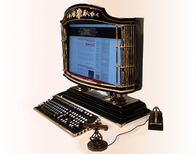
I happened to come across an old article over Dark Roasted Blend about PC case mods. The article itself is really a giant photo gallery of some interesting mods, some I consider to be ingenious works of art, others which are downright trashy. There are also links to sources that show you the step-by-step process on how those mods were created, which I always find fascinating.


A metal box with cathode lights, grapefruit-sized exhaust fans, and tribal-patterned glass etchings does NOT make a good case mod!!! I find those types of case mods to be irritatingly annoying; they all seem so industrial and uncreative. It's like The Fast and the Furious: Tokyo Drift in a box. Also, what the heck is up with aliens, skulls, and gothic towers? It's horribly cliched and flat out UGLY.

I like cases that show ingenuity, something that makes me go "Oh! Why didn't I think of that?", something where form meets function. Something simple, artistic, elegant, not outrageous for the sake of having a hulking, mechanical beast.


This mod shown above is actually pretty clever. The case itself is made from an IKEA trash can. I like it because it takes something that I commonly see everyday and transforms it into something unintended. Yes, there is a lot of wire tubing, and even a cathode, but the way this was constructed makes it seem clever and innovative. And it looks quite simple. Plus, the trash can itself is $4, so you can't go wrong with that!


No doubt some of you may have already seen the Victorian-era PC mod. I think it looks beautiful, and is truly a work of art and craftsmanship. The flowery/ivy etchings on the sides of the monitor look exquisite, and the adjustable railings look smart. Don't get me started about that webcam (or microphone?), although the mouse looks a bit painful. I like my mice ergonomic and comfortable, thank you very much.

What are some interesting case mods you've seen?

Tuesday, August 12, 2008

principles are principles for a reason

john kane on graphic designers:
we're actually little nerds going around solving problems.

written on my principles of design syllabus, 2004
and always remember:
.content dictates form
.less is more
.God is in the details

Wednesday, July 30, 2008

The Fun-O-Meter

Here's a pretty nifty art installation project. An artist (or prankster...but it takes creativity to be both, right?) obtained a toy vending machine and stuffed it with capsules filled with IDEAS. It's sort of like a fortune cookie, except more productive and less "Confucius Says."


For a mere 50 cent insertion fee, you get an idea, a lucky penny, a vending machine toy, and a quarter refunded to you (so you're really only paying 24 cents). The artist felt that 50 cents was too expensive to charge for an idea, so he placed a quarter inside every capsule. The ideas usually contain things to do, like small pranks, daily activities, or traveling (in this case a map is provided). The lucky penny is so you can brighten a stranger's day by placing it on a sidewalk somewhere.

The Idea Vending Machine (via MAKE)

Tuesday, July 15, 2008

philip glass for sesame street


i can't believe i watched this as a kid. i remember seeing it and being a little creeped out by the song, but at the same time it was kinda mesmerizing. now, with a thorough graphic design education, i have such a greater appreciation for this! i was actually being fed something pretty complex in terms of graphic systems, color, and music. it's really quite wonderful. i don't know how much influence philip glass had in the visuals or if he had any say at all on what it was supposed to be, but i think it's really cool how sesame street managed to expose kids to artsy conceptual things like philip glass and design principles without them really knowing.

totally rad, i say.

Saturday, July 5, 2008

BecauseWeCan: Three Rings Design office project


I'm insanely jealous of the people that work at Three Rings Design, a video game company located in San Francisco. Of course, if you work in an office with that architecture, you deserve to be envied. Who wouldn't want to have a giant tentacle squid couch sitting in the middle of their game room?

BecauseWeCan (Oakland, CA) is an architectural studio that designs office furniture and work environments. Unlike other firms, they actually build the stuff they create (rather than hiring contractors to build for them), hence lowering costs, but providing the highest quality design and materials for their clients. Plus, they come up with creative, affordable solutions to what would otherwise be an expensive problem (see lighting).


What they've done for Three Rings is pure genius and beauty. They've converted an entirely blank, boring, square office space into something teeming with life and three-dimensionality (hell, let's thrown in an extra five-dimensions because it's that freakin' awesome). The office has a style and personality all its own, and it's quite obvious that it was a mutual labor of love from both the clients and the contractors.

Links to photos of their work in progress:
Parts 1 | 2 | 3 | 4 | 5 | 6 | 7 | 8 // Finished Product // Flickr

Creative Design/Hacking + Cost-Effectiveness + Eco-friendly = SMART.

Also, that squirrelly Tree Stump coffee table is too cute for words.

Monday, June 30, 2008

Nagi Noda's Hair Hats

Hair Hats @ Uchu-Country.com (Flash required)


(Edit: OK, so originally this post was supposed to be about toupees and hair hats, but after doing a little internet research, it has turned into a Nagi Noda tribute links post.)

Nagi Noda is a designer/auteur with a creative flair of all things "WTF?!?". She makes things that probably belong in some upscale Giant Robot store. Or on display in a museum. Of Jurassic design.

Related Links:
Biography [Partizan.com]
Big Eyeballs
Hanpanda.com
Mariko Takahashi's Fitness Video For Being Appraised as an Ex-Fat Girl

Saturday, June 28, 2008

economy!


Fossil watch designed by Philippe Stark

i really have to say that i think the design of this watch is really sleek and modern – no extra parts, nothing to get your watch snagged on. simple. each little bar is one minute and the digits appear at their expected locations to indicate what hour it is. simple, again! intially, i could imagine it to be difficult to get a hang of reading the minutes at a quick glance, but it's just about the same, if not better, than reading a bland movado watch. my favorite part? the negative space of the ring. what a fun watch tan you could get!