Showing posts with label typography. Show all posts

Friday, September 25, 2009

Logos and designs in different languages

Something you don't see everyday (at least in this country!). We're constantly surrounded by examples of typography designed using the Latin alphabet, so it's interesting to see typography from a non-alphabetic origin. I stumbled across some cool flags from Japan.


Itami municipality: The kanji 伊 (i), symbolizing a swan of the Koya Pond. (Wiki)

Every municipality in Japan has a flag, which incorporates parts of its name into some sort of design or logo that represents what that area is famous for (like the one above). Some flags are actually "picture-puzzles," leaving the viewer to try and decipher how the name is represented (like the one below). To be honest, my untrained eyes don't recognize most of the characters, even the ones in plain sight.

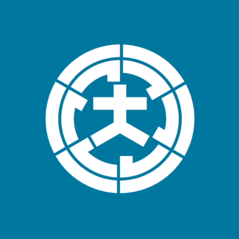
Omura (in Nagasaki): picture-puzzle logo features the kanji 大 (ō) surrounded by six (mu) katakana ラ (ra).

What are some other nifty type designs you've seen in other non-alphabetic languages?

Typographic town logos in hiragana/katakana (via PinkTentacle)
Bonus one in Arabic, it's a poem! (via Flickr)

Monday, April 6, 2009

UGHHH, I LOVE TYPE


GLORIOUS GORGEOUS TEXTURES OF TEXT!
http://www.houseind.com/

man. these are beautiful vintage-esque typefaces. i just asked for a free catalog of their stuff. eeee, typefaces in the mail!!

Saturday, October 18, 2008

reading typefaces


these are so right. LOL IRL, dawgs.
check out the rest of the dude's studies on flickr.

Thursday, July 17, 2008

MY NAME IS RAIN.


so i first saw this commercial while i was in the philippines. i was so excited to see his babyface on tv, and then aghast when i realized it was a dandruff shampoo he was endorsing. but i've been raving about his one-liner in this commercial to my US friends who remotely know rain. thank you, youtube.

holy moly. the type in this is alright for the most part. i just don't know why there are a billion different treatments for the type's motion; there's no system in place -- that's the biggest issue here. it's hard to read during some moments. and why in the world do they had to plug their logotype in with the rest of the type. advertising is the devil. white text on black is like dandruff, now that i think about it.

this is the most ridiculous shampoo commercial i've ever seen, but i have to admit that i LOVE IT. whoever wrote the script is a genius. hey, rain gets dandruff too.. and that's why he uses Clear. because DANDRUFF NEVER COMES BACK. CONFIDENCE MEANS NO DANDRUFF. MY NAME IS RAIN. (he likes black.)

Monday, June 30, 2008

type in motion: square


edits still need to be made. comment for any concerns or suggestions, please! (unless it's about the crappy compression -- can't help that.)